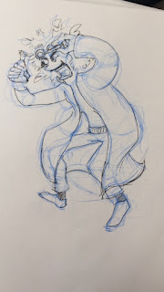
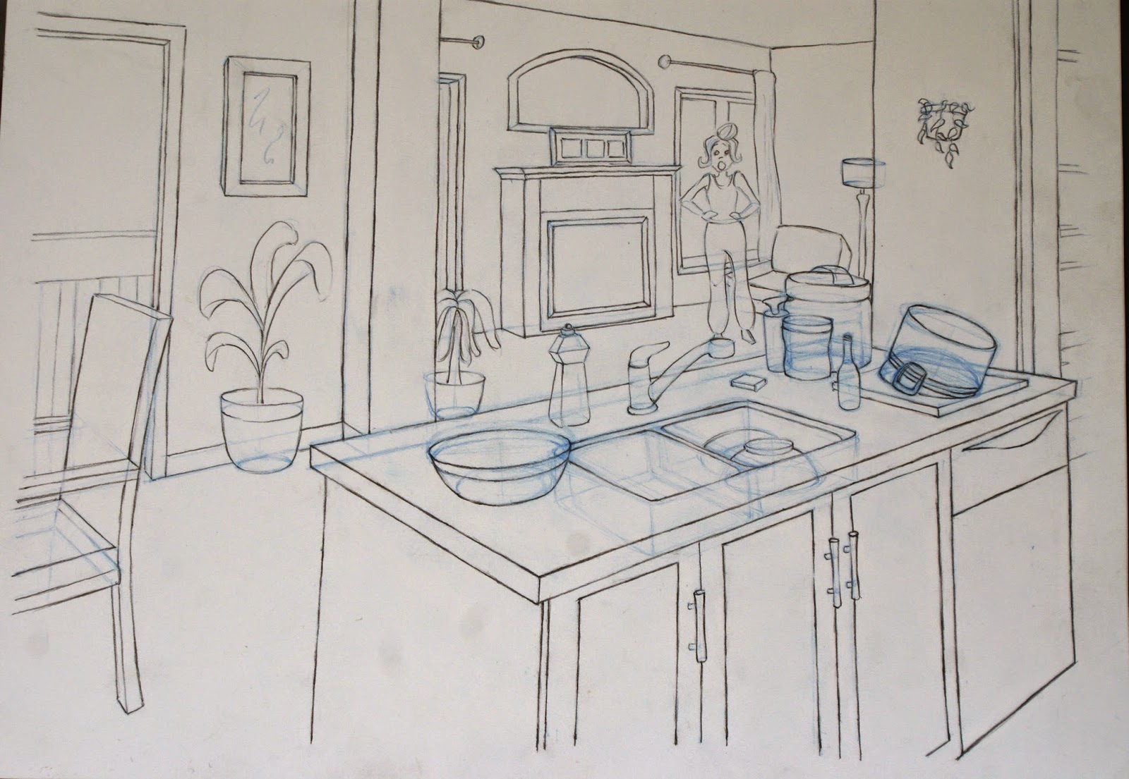
character expression and poses
When playing with expression try stretching the faces and add wrinkles to emphasize the expression. Also think of if the expression of the character would match his.her personality or not. Same applies to the action poses.
character design week update****
Sorry I haven't been updating my blog lately.. but heres are all the weekly designs all bunched up in one post! What I have noticed was that every week my designs were slightly improving whether it was the action, or the overall character in general. Keep on practicing! Enjoy. :)
Week 2: Witch
For this character I gave her a shy personality and I reflected that persona through her action; her arms and legs are very bunched up together. If you look closely, I gave her short eyebrows which can also indicate a shy character trait.
Week 3: Scientist
I know his action is a bit off but I want my posts to be genuine! As you can see it's a mad scientist with an unknown substance in his hand. I portrayed his personality by giving him a malicious smile with dark thick eyebrows. I was also watching a lot of " the Simpsons" during that week and as you can see, it has rubbed off on my drawing. So watch a lot of cartoons! It helps. I also added curves and overlapping lines which creates dimension and movement to the coat.
Week 4: animal gangster
This week's theme was a gangster but in an animal's body. I chose a dog and give him a spiky haircut and mad eyes. I added wrinkles so it can provide exaggeration to the face. I of course had to add the bootcut jeans, leather jacket, choker, and piercings to exaggerate the bad boy look.
Week 5: Animal king
I wanted to chose a unique animal for this weeks theme, and since a rat king is hardly done I stuck with that. Instead of making the king heroic, I gave him a snarky and evil look through providing thin pointy eyes and eyebrows. I coloured his skin green to emphasize a snarky look.
Note: When doing character design, you always need a reference. It gives your character a more descriptive detail and it overall just looks better.
explore different styles
These past couple of days I've been searching on the web for inspiration because noticed that 90% of the art that I do is based on just my college's requirements. In other words I haven't been doing a lot of what I personally want to do. I came across a youtuber called animated decisions and her sketchbook for calarts really helped me approach art from another perspective. From that point on I looked up matisse's art and was totally awed by his use of lines and contour. I recently also got involved with marker drawing and currently playing around with it.
When doing art, you'd always want to explore your limits through different use of mediums as well. It might be intimidating at first but if you spend time on it, you'll probably learn the basic concepts of it within a week.
This second picture is when I started to explore this style through the us of my imagination alone. I first tried to design a character which didn't really match the style I was going for. The character was also stiff. The second character, I was more aware of what I had to do and I learned from my mistakes from my first design. I even became more confident with my lines and added a nice loose action pose for the character. It just goes to show that through drawing more, you get more confident and your lines become less stiff. I then went over with pen and marker, trying to capture the folds of the shirt and capturing the shadow of the shirt. Again, I used contrasting colours to make my character stand out (Orange contrasts with great and grey). After that I drew a contour drawing of my mom and some cartoon drawings off my head.
Have fun exploring! :)
character design week 1 : AUSTRONAUT
If you want to get into animation, you'd want to be constantly designing character as it provides you many ideas and it gets you into the concept of drawing characters in general. As you draw more, you may find yourself loosening up whether its coming up with ideas or overall drawing. Every week I am planning on coming up with a new character according to a theme. REMEMBER: when you come up with a character, keep in mind that the pose, outfit, and face of your character should all mesh into one personality. For this design, the girl has a tomboy, lazy, laid back character to her. That's why she's leaning onto the pole and the reasoning behind her thick and pointy eyebrows. I then gave her lazy eyes and small lips to show that she's not very enthusiastic.
ALSO, line quality! I inked over my lines to show line quality which is HUGE if you want to get into anything art related. Line quality can bring 3 dimension to your drawing. Im going to touch on some of the basics of line quality such as anything infant of an object, the line should be thicker and darker. Anything in the back should be lighter or thinner. Make sure your lines are crisp and not edgy. This only covers up a tiny portion amount of what you need to know about line quality but I will be going over this topic more through future posts.
Have fun designing!
hand drawing 01
Here's my hand study from my sketchbook. The first page are drawings from my hand and observing the curves and edges of it. I tried different poses and added construction lines. Remember: construction lines are important! Whether it's for hands or characters, you need construction lines for everything. I then used a red marker to colour the background of 2 of my drawings because 1. it covers up mistakes and 2. it contrasts with the blue pencil so the hands pop out and it's appealing to the eye 3. I helps you practice negative shapes. When practicing negative shapes, you focus on not the hand but the outside of the hand. You would often find many mistakes when you study negative shapes because you pay more attention to proportion of the outside gap. The second hand drawing is cartoon influenced, as the hands are much more exaggerated and bigger than a normal hand. Start drawing cartoon hands once you are comfortable and understand the basic concepts of how to draw hands based off of real life.
2015 Sheridan Animation Portfolio (DENIED)
LIFE DRAWING:
ANIMATION AND CHARACTER DESIGN:
STORYBOARDING:
LAYOUT:
PERSONAL WORK:
Oil on canvas
Acrylic on canvas
Acrylic on wood
Ink on thick paper
Graphite on newsprint
SCORE SHEET:
Subscribe to:
Comments (Atom)


